

About the Validation Text Area widget
A Spry Validation Text Area widget is a text area that displays valid or invalid states when the user enters a few sentences of text. If the text area is a required field and the user fails to enter any text, the widget returns a message stating that a value is required.
The following example shows a Validation Text Area widget in various states:
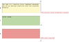
- A.
- Characters remaining counter
- B.
- Text Area widget in focus, maximum number of characters state
- C.
- Text Area widget in focus, valid state
- D.
- Text Area widget, required state
- E.
- Characters typed counter
The Validation Text Area widget includes a number of states (for example, valid, invalid, required value, and so on). You can alter the properties of these states using the Property inspector, depending on the desired validation results. A Validation Text Area widget can validate at various points—for example, when the user clicks outside the widget, as the user types, or when the user tries to submit the form.
- Initial state
- The widget state when the page loads in the browser, or when the user resets the form.
- Focus state
- The widget state when the user places the insertion point in the widget.
- Valid state
- The widget state when the user has entered information correctly, and the form can be submitted.
- Required state
- The widget state when the user has failed to enter any text.
- Minimum Number Of Characters state
- The widget state when the user has entered fewer than the minimum number of characters required in the text area.
- Maximum Number Of Characters state
- The widget state when the user has entered greater than the maximum number of characters allowed in the text area.
Whenever a Validation Text Area widget enters one of these states through user interaction, the Spry framework logic applies a specific CSS class to the HTML container for the widget at run time. For example, if a user tries to submit a form, but has not entered text in the text area, Spry applies a class to the widget that causes it to display the error message, “A value is required.” The rules that control the style and display states of error messages exist in the CSS file that accompanies the widget, SpryValidationTextArea.css.
The default HTML for the Validation Text Area widget, usually inside of a form, comprises a container <span> tag that surrounds the <textarea> tag of the text area. The HTML for the Validation Text Area widget also includes script tags in the head of the document and after the widget’s HTML markup.
For a more comprehensive explanation of how the Validation Text Area widget works, including a full anatomy of the Validation Text Area widget’s code, see www.adobe.com/go/learn_dw_sprytextarea.