

Change the appearance of button states
Just as an image is contained in a graphics frame and text is contained in a text frame, a button appearance is contained in a button frame. However, unlike other frames, a button frame can have multiple child objects that apply to different states.
Each button can have as many as three states: Up, Rollover, and Down. The Up state appears unless the mouse pointer moves into the area (Rollover) or the mouse button is clicked on the button area (Down). Different appearances can be applied to each of these three states. You can select from a set of preset appearances, or you can create and define new states.
By default, any button you create is defined with the Up state containing the button’s text or image. When you create a new state, the appearance of the currently selected state is used. To distinguish a state from the others, you can then add text or an image, or you can delete the state’s contents and add new contents. If you convert an object to a button, the contents become the Up state of the button.
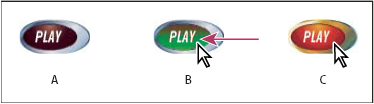
- A.
- Pointer not over button area (Up)
- B.
- Pointer enters button area (Rollover)
- C.
- Pointer clicks (Down)
 Change the appearance of a button’s states
- Choose Window > Interactive > States to display the States panel.
- Using the Selection tool
 , select
the button in the layout that you want to edit.
, select
the button in the layout that you want to edit. - Do one of the following:
-
In the States panel, select a preset option from the Appearance menu. The preset options create slightly different button appearances for the Up, Rollover, and Down states.
-
From the States panel menu, choose New State to create the Rollover state. Choose New State again to create the Down state. If the Up, Down, and Rollover states exist, the New State option is dimmed.
-
- To change the appearance of a state, do any of the following:
-
To place a text file or image in the state, select the state in the States panel, and then either choose File > Place or choose Place Content Into State from the States panel menu. Double-click the filename of the text or graphic.
-
To paste an image or a text frame, copy it to the Clipboard, select the state in the States panel, and then choose Edit > Paste Into.
-
To type text, select the state in the States panel. Using the Type tool, click the button and type the text. For buttons converted from other objects such as placed images, choose Delete Content From States from the States panel menu, click OK to delete the contents, and then use the Type tool to click on the button and enter the text.
 Use the Control
panel to format the text. Use the Text Frame Options dialog box to
center the text within the button.
Use the Control
panel to format the text. Use the Text Frame Options dialog box to
center the text within the button. -
To change the stroke and fill of the state’s contents (such as a text frame), select the state in the States panel and use the Direct Selection tool
 to
select the button contents. In the Swatches panel, select the Fill
or Stroke icon and specify whether the stroke applies to text or
the frame, and then click a color in the Swatches panel. You can
also use the Stroke or Color panel to change the appearance.
to
select the button contents. In the Swatches panel, select the Fill
or Stroke icon and specify whether the stroke applies to text or
the frame, and then click a color in the Swatches panel. You can
also use the Stroke or Color panel to change the appearance.
-
Change the contents in button states
Create button rollover effects
In some cases, you may want the button area to be invisible until the mouse pointer is moved over it. One way to achieve this effect is to apply an image to the Rollover state in the States panel.
- Create the second button that will be displayed during
rollover. You may want to place an image and then convert it to
a button.
You can also create a button that displays a second button. This is especially useful if you want one button to act as a “hot spot” area that displays a larger image, or an image in a different area. For example, when you move a pointer over a map, an image could be displayed that represents a region, and the image could disappear when the pointer moves away from the region.
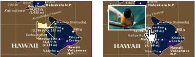 In the exported PDF, holding the pointer over a hot spot causes an image to appear.